The Usual
Mapping a contact-free, mobile-focused, guest experience for a rebranded, sustainability-oriented hotel chain.
Role:
UX Designer
Client:
Xcentric Hotels B.V.
Work scope:
Competitive Analysis / Customer Journeys / Wireframes / High Fidelity Screen Designs
Background & Overview
After facilitating a Design Thinking workshop at Xcentric for my colleague Olubnmi, founder of Kajola Ventures, I learned that the team was developing an app to support their hotel guests at The Usual.
The Usual seeks to support travelers who care about the planet and want to live and spend according to their values. I was brought on board to build a website and mobile app that delivered on the brand values without sacrifice to the user experience.
The Problem
Structure a website and mobile app that allows hotel guests to see that they are contributing to sustainability while experiencing a modern and technologically advanced moment. Reduce the requirement for points of contact with staff and simultaneously make access to customer service accessible.

Hotels have to be more than a place to sleep.
Like most businesses at the moment. hotels have had to earnestly express their values through the products and services they offer to customers. For The Usual Hotels, those values uphold sustainability and a focus on local resources. Going along with the current trend towards multi-functional work/living spaces, hotels must also be flexible and useful beyond offering a traveler a place to sleep for the night.
Image: Tania Miron

If it's not easy and mobile, it's not right now.
The target market includes people who expect a mobile, accessible, and easy experience. A useful and transparent website as well as a fully-featured mobile app are minimum requirements..
My Process
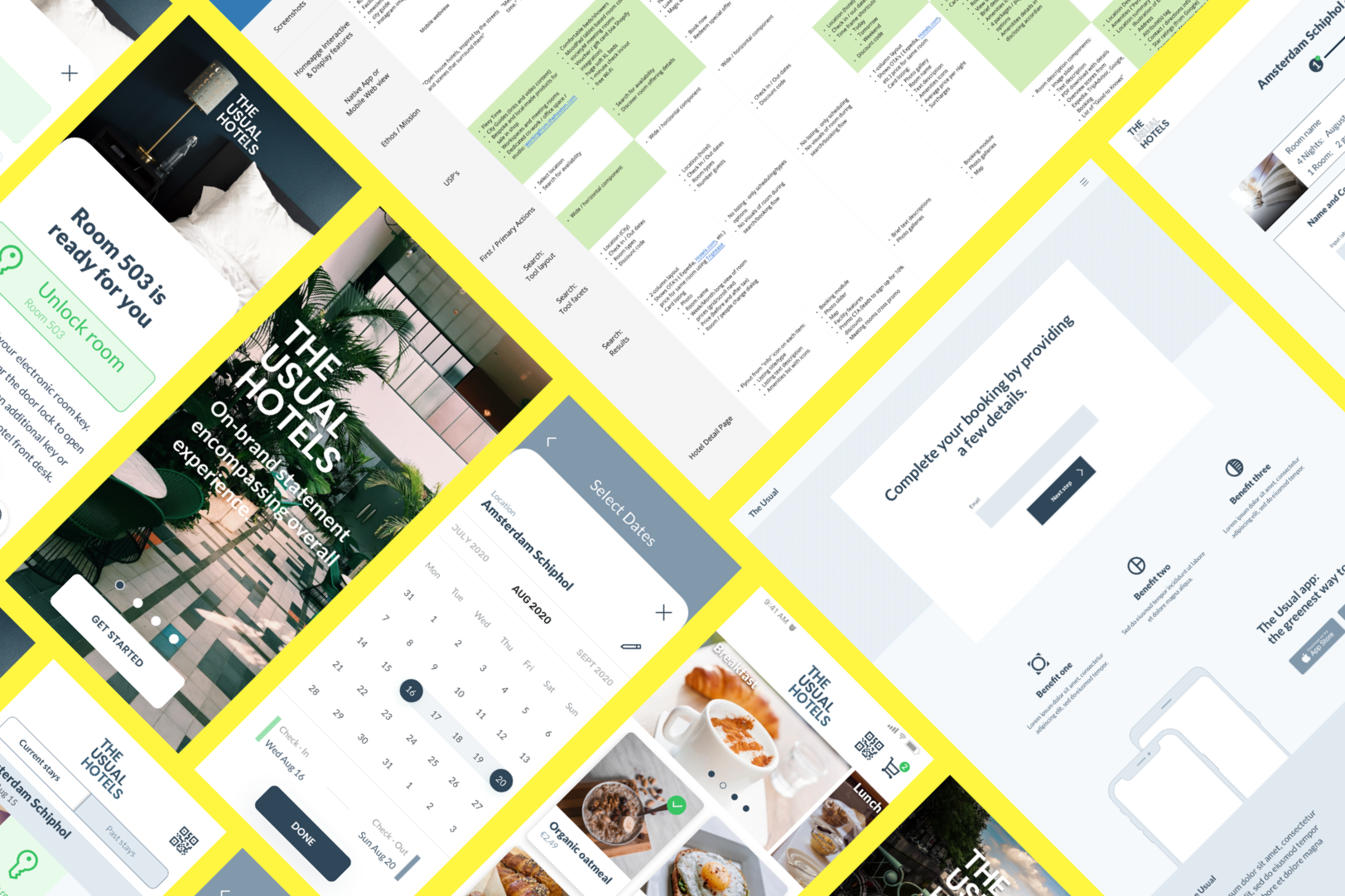
This project was equal parts research and UX artifact execution. I began by deep diving into both the products of competitors and the most frequently used patterns on products in the same business sector. After collaborating with the Xcentric team on the best approaches to take, I created flow and wireframe documents to chart the customer experience.

Knowing what to do is sometimes knowing what NOT to do.
The Xcentric team shared their list of primary competitors with me. I added a few industry standard bearers to this list to get a truly comprehensive take. In order to understand what promises and services those competitors were delivering, I studied and documented multiple user paths through each organization's website and mobile app. I established a matrix with 19 attribute areas against which each competitor was measured. These attributes included aesthetics, usability, and functionality aspects. Using the infinite whiteboard tool, Miro, I presented my findings and collaborated with the team to confirm the directions I would take into the flow and wireframing stage.

Plotting the user's journey from desktop to check in.
Some parts of the user experience were already prescribed: being able to start the process on mobile, continue it on desktop, and conclude it on mobile, for example. Other aspects were left to my creativity and usability sensibilities. To demonstrate the flow of the user experience, I created desktop screen and mobile screen wireframes using Sketch. To give a more realistic sense of how the experiences would play out, I created high-fidelity screen designs and clickable prototypes for desktop and mobile.
The Outcome
At the conclusion of the project, I had delivered a package that included market intelligence and competitor analysis, mapped out flows for the most common user behaviors, feature implementation concepts, and screen layouts – exactly what was needed to move their project into the development and high fidelity design phase with an external agency.


Like what you see?
Don’t hesitate to reach out so we can chat about working on a project together.